

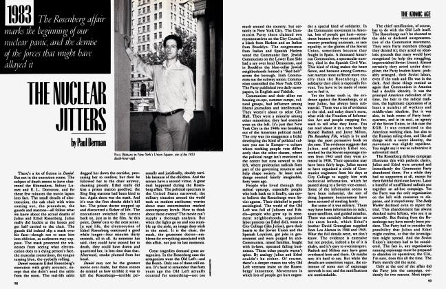

Sign In to Your Account
Subscribers have complete access to the archive.
Sign In Not a Subscriber?Join NowTHE GOLDEN, FLOATING WORLD OF SOTATSU
Clement Greenberg
Back in October 1966, in the museum in Nagoya, on the eastern side of Japan, I was brought up short by an old large painted screen that showed only an expanse of rhythmically, almost mechanically repeated “carved” green waves under a flat gold sky. It wasn’t just the distilled splendor of the screen that stopped me; I was stopped too by its “far-outness.” Repetition was being pushed to its pictorial limits, given that the screen was intended, obviously, as more than decoration alone. It seemed to anticipate avant-garde painting in our time.
A label on the wall next to the screen, which was spread flat, said in Roman letters that the artist was one Tawaraya Sotatsu, who was bom at an uncertain date in the latter sixteenth century and died, it is presumed, in 1643. (Very little, I found out later, is known about his life.) After leaving Nagoya I made a point of looking for more Sotatsus, and discovered that he was the rage in Japan. Many Japanese thought him the greatest of all their painters. In Kyoto a big sign outside a complex of booths next to the temple that houses a thousand and one images of the bodhisattva Kannon announced in Roman capitals that a painting by Sotatsu could be seen inside. I went in among the booths, saw a big painting of a lion on wood, and was disappointed. But afterward I found more and better Sotatsus, though not nearly enough—too much of the best old painting in Japan seems to be in private collections that take effort to get into.
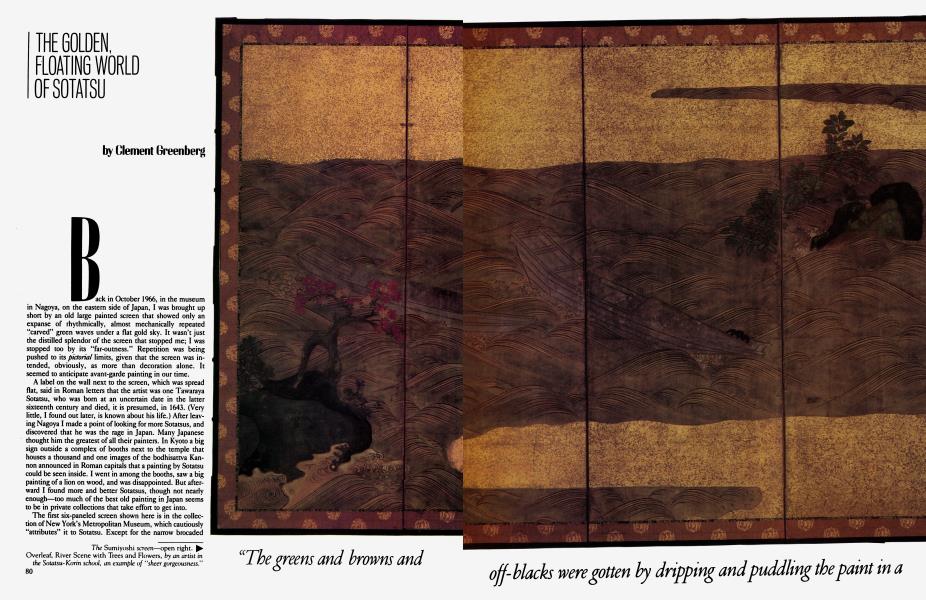
The first six-paneled screen shown here is in the collection of New York’s Metropolitan Museum, which cautiously “attributes” it to Sotatsu. Except for the narrow brocaded borders, it is made entirely of paper, several layers glued together. The surface has been indurated with a heavy sizing (animal-skin & glue dissolved in boiling water), whichls also the vehicle, or medium, for the colors. This technique is known in the West as distemper. Its point, or part of its point, is the unshiny, matte effect it achieves. Japanese painting seems to set much store by that effect in conjunction with the opposing effect of gilt.
"The greens and browns and off-blacks were gotten by dripping and pudding the paint in a way somewhat—but only somewhat —like Jackson Pollock's"
SOTATSU
Sotatsu laid his screen flat on the ground in order to work on it. That’s obvious. The grainy gold areas were obtained by sprinkling gold dust through a sieve onto the sizing of the paper while it was still wet. And the greens and browns and off-blacks of the three curious islets were gotten by dripping and puddling the paint in a way somewhat—but only somewhat—like Jackson Pollock’s. Also, the screen has had its paint dusted from above with gold. Furthermore, the very precise and regular gold and gray ink lines that “carve the waves could have been inscribed only on a horizontal surface,
Here and there the screen has suffered from mishandling, but hardly from age. You have to come close to notice that. But you can’t come close so easily when the screen is freestanding, with its panels jutting out and in. Then it holds you off almost the way a big sculpture would. And then too the experience becomes ambiguous: Is the screen a picture? If not, what else can it be? But the question really doesn’t have to be answered; the screen is there in all its beauty, and the classification of it doesn’t matter; the ambiguity is part of the beauty.
What “makes” the screen, what makes its beauty, is simply—and then not so simply—the gray blue waves with their alternation of darker gray and gold contouring lines. The two empty boats are at the same time essential, in themselves and as part of the whole. What they mean, nobody knows, which somehow makes them all the more affecting. The shapes and colors of the islet outcroppings, and the trees with their leaves, sing out against the blue gray ness and the abstract gold, and they also make for a “composition.”
In “reading” the screen I find the areas of gold puzzling (apart from their aesthetic effect). Obviously they represent dry land. But they do so in such a way as to change places with the billows, and look in their abstractness more like the sea than the billows do. After all, the sea, water in general, does appear more “abstract” than solid ground. Did Sotatsu mean to puzzle us here? Perhaps the Japanese eye became so accustomed to gold that it instantly felt what gold represented in any context. Even if this was so, I still sense a certain mischievousness in what I know of Sotatsu’s art.
It’s a mischievousness that’s apt to belong to a headstrong master, especially a Japanese one, and to a master with such a range. It’s not just that he painted fans, sliding doors, and walls as well as screens; it’s that he did so with such a variety of effect. The only Western parallel I can think of is Picasso (who had his own mischievousness).
Sotatsu helped found a school of painting that can’t be matched for sheer gorgeousness. He and Ogata Korin (1658-1716) after him, especially Korin, created art of a supernal “prettiness,” a decorative sumptuousness, that manages to be overpowering. Not the Greco-Romans, not even the Chinese or the Persians, anticipated this kind of gorgeousness. It’s a kind that by now underlies, I think, Western notions of the utterly pretty. But this takes nothing away from it. When the pretty becomes overpowering it transcends itself, becomes something other than the “merely” pretty.
This screen isn’t an example of Sotatsu’s gorgeousness. One of his flower screens, like one of Korin’s, might look deceptively familiar to Western eyes. This screen gives a better idea of his range—and it’s also, as I’ve said, the best work of his that I’ve seen. It’s certainly more eye-opening.
“Formalist” that I’m supposed to be, I haven’t yet said what the screen—the painting on it—is about. It illustrates an episode from the tenth-century Tales of Ise, a Japanese classic. The tales are prose in part, but mostly verse. The attributed tide of the screen is Sumiyoshi, which is the name of a white-sand beach south of Osaka (now much built over). In this episode an emperor visits the beach with a courtier, and is so moved by the scene that he composes and recites a short poem. The tutelary god of poets—who is also the god of seafarers—happens to belong to Sumiyoshi beach; he manifests himself and delivers a poem of his own in response to the emperor’s, the way any cultivated Japanese is, or was, supposed to. That’s all.
Sotatsu shows us nothing of this event. All he illustrates is what the emperor and the courtier, and maybe the god too, might have seen as they stood looking out from the beach, and not even the white sand beneath their feet. And all the two poems deal with is the feeling derived from what was seen. Which was Nature; no mention is made in either the prose or the verse of the two drifting boats, man-made. There’s a kind of “coolness” in all this. Nature induces distance, makes the artist noncommittal even when there’s nothing to commit himself to. This distancing makes for a very high degree of aesthetic sophistication. This was Japanese culture three centuries ago.
Thanks are due Barbara Ford and Mitsuhiro Abe of the Metropolitan Museum, and Mryeko Murase of Columbia University, for what they told me about the making and the meaning of the Sumiyoshi screen.
Subscribers have complete access to the archive.
Sign In Not a Subscriber?Join Now


