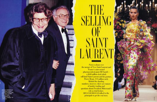
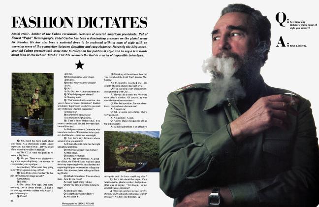
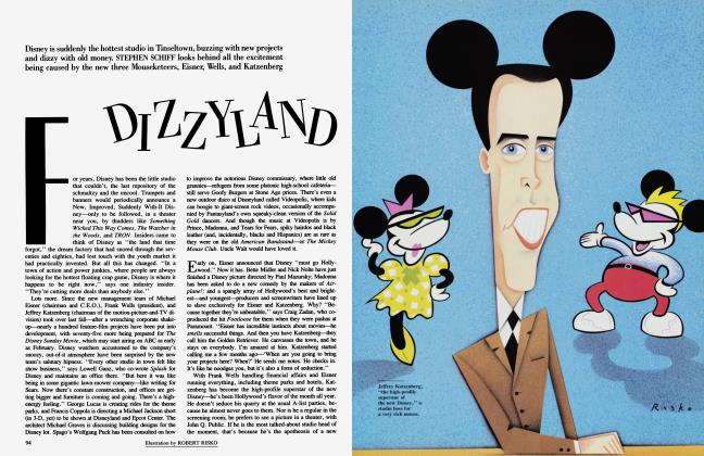
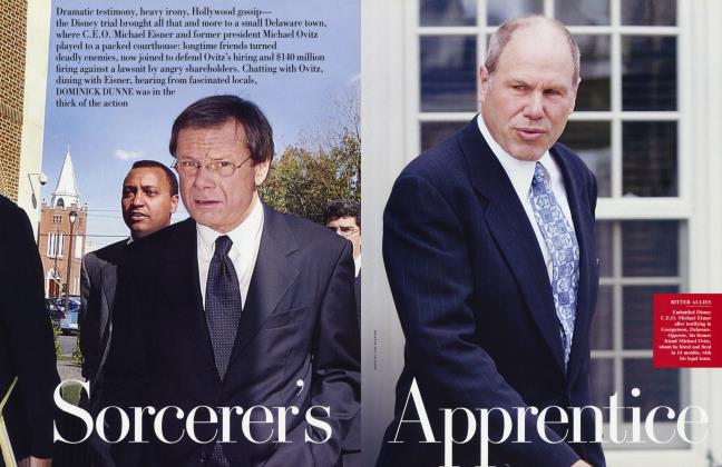
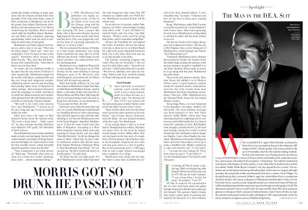
Sign In to Your Account
Subscribers have complete access to the archive.
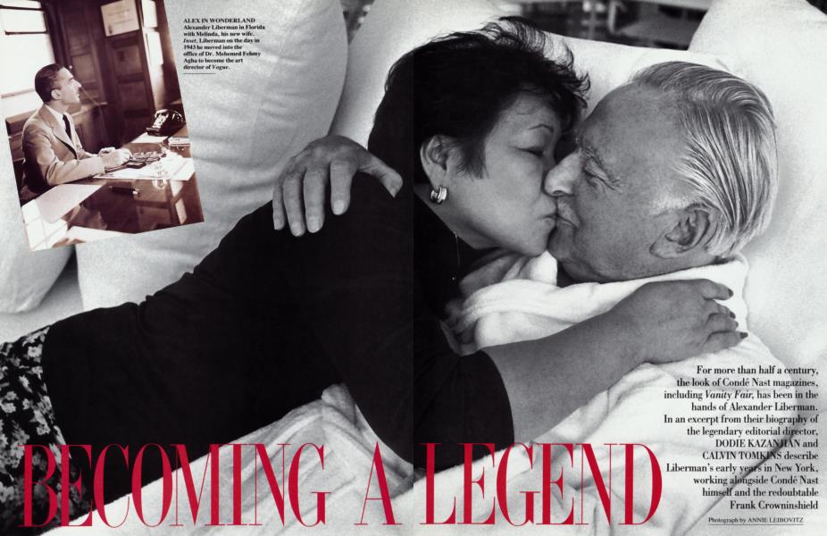
Sign In Not a Subscriber?Join NowFor more than half a century, the look of Condé Nast magazines, including Vanity Fair, has been in the hands of Alexander Liberman. In an excerpt from their biography of the legendary editorial director, DODIE KAZANJIAN and CALVIN TOMKINS describe Liberman's early years in New York, working alongside Condé Nast himself and the redoubtable Frank Crowninshield
For more than half a century, the look of Condé Nast magazines, including Vanity Fair, has been in the hands of Alexander Liberman. In an excerpt from their biography of the legendary editorial director, DODIE KAZANJIAN and CALVIN TOMKINS describe Liberman's early years in New York, working alongside Condé Nast himself and the redoubtable Frank Crowninshield
When Alexander Liberman arrived in New York as a war refugee in 1941, he was penniless but not without resources. His parents had preceded him, and his father, a businessman with interests in the Canadian timber industry, offered to give Alex $200 a month so that he could follow his chosen path of becoming an artist. But Alex was not alone. He was deeply in love with Tatiana du Plessix, a war widow who, like Alex himself, had been bom in Russia, and whom he would soon marry. Alex had overcome great obstacles to bring Tatiana and her 10-year-old daughter, the future writer Francine du Plessix Gray, out of Europe with him, and he was determined to provide for them in America. Putting his ambitions as an artist to one side for the time being, he set about looking for a job.
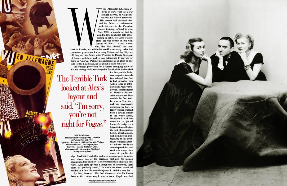
The obvious profession for a former managing editor of Vu, the photographic newsmagazine for which he had worked for four years in Paris, was magazine journalism. A friend from Paris had provided him with a letter of introduction to Alexey Brodovitch, the art director of Harper's Bazaar. Alex went to see Brodovitch the first week he was in New York and was enormously impressed by him. A fellow Russian who had been a cavalry officer in the White Army, Brodovitch had become the recognized leader of a design revolution that was affecting the look of magazines, books, advertisements, and commercial photography in this country; he was also a teacher whose students would spread that revolution in many other areas of graphic design. Brodovitch told Alex to design a sample page for women's shoes; one of the perennial problems for fashion magazines, then and now, is to present shoes in attractive new ways. Alex came up with a design that he described, years later, as "perfectly awful," in which the shoes traced the outline of a face. Brodovitch rejected it, and that was that.
The Terrible Turk looked at Alex's layout and said, "I'm sorry, you're not right for Vogue."
By then, however, Alex had discovered that his former boss at Vu, Lucien Vogel, was in town. Vogel, who had escaped from occupied France only two months earlier, was now a consultant to Condé Nast. He invited Alex and Tatiana to his apartment on Sutton Place South, and there Alex renewed his acquaintance with Iva Sergei Voidato-Patcévitch, yet another dazzling Russian émigré, whom he had known earlier as the business manager of Condé Nast's Paris operations. Patcévitch was now Condé Nast's main financial adviser, the number-two man in the organization and Nast's chosen successor; he would become president of the company when Nast died, a year later. He readily agreed with Vogel that Alex should come to work for Condé Nast. Patcévitch said he would speak to Nast about it.
A few days later, Alex went into the Vogue offices to meet Mehemed Fehmy Agha, the Condé Nast art director. Dr. Agha, as he liked to be called, was known around the Vogue offices as the Terrible Turk. He had a cynical, sarcastic wit that intimidated nearly everyone, but he was greatly respected throughout the magazine world for the way he had modernized the look of Nast's magazines. Born in Russia of Turkish parents, Agha had learned the principles of Bauhaus design firsthand in Germany, where his early graphic layouts for the German edition of Vogue had caught Condé Nast's eye. The portly, monocled Dr. Agha received Alex Liberman with barely veiled disdain and told him to report for work in the art department the following Monday. When Alex appeared that morning, he was given the job of designing a two-page spread of drawings by the Vogue fashion illustrator Jean Pages. He spent most of the week on this rather mundane assignment. On Friday, he was called into Agha's office. The Terrible Turk pointed to a number of what he called "holes" in Alex's layout and said, "I'm sorry, you're not right for Vogue."
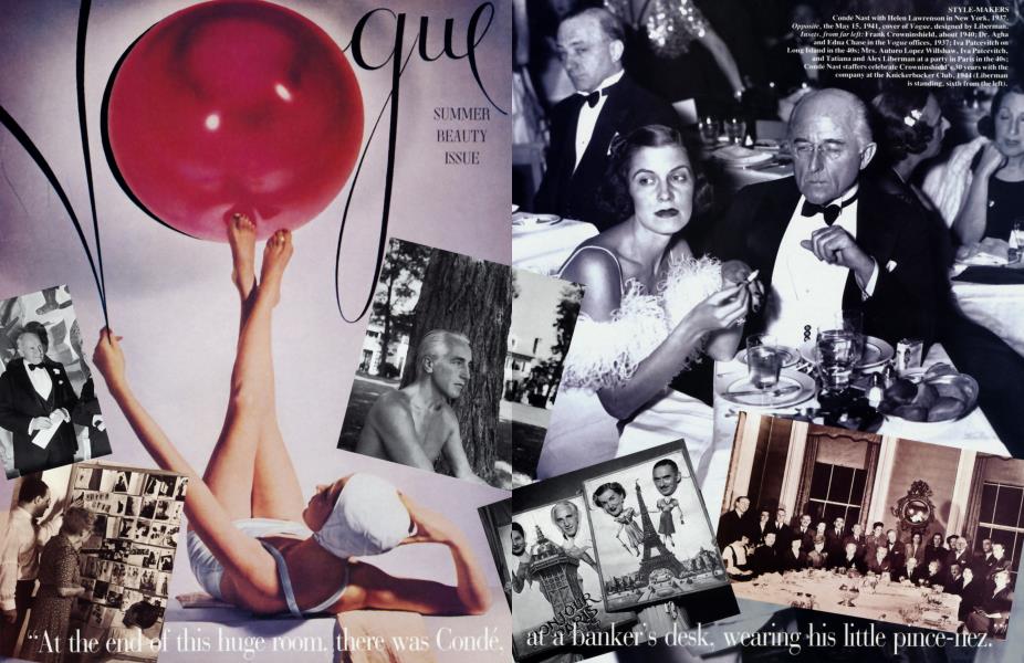
"At the end of this huge room, there was Condé, at a banker's desk, wearing his little pince-nez."
Alex picked up his paycheck and went back to the Windsor Hotel, where he and Tatiana had taken rooms. He felt crushed and desperate; maybe he wouldn't be able to find a job after all. The telephone rang. It was Mary Campbell, Condé Nast's personal secretary, telling him that he had an appointment with Mr. Nast, whom he had not met, on the following Monday morning.
Nast's office was much bigger than Agha's. "You had to walk the length of this huge room," Alex remembered, "and there was Condé, at a banker's desk, wearing his little pince-nez. It became clear very quickly that Nast did not know that Agha had already hired and fired me. We talked about various things—Vu, and French publishing, and Vogel—and I showed him a certificate I had brought along, for a prize I had won at the Universal Exposition in Paris in 1937. It was for a photomontage display on how magazines are created, and it had won a gold medal. There was this certificate with my name on it, although to tell the truth I don't really remember doing the montage. The minute Nast saw it, he said, 'Well, a man like you must be on Vogue.' And he pressed a buzzer, called Mary Campbell, and said, 'Please send in Dr. Agha.' Agha came in while I was sitting there. Nast said, 'Dr. Agha, this is Mr. Liberman. I would like him to be in the Vogue art department.' And Agha said, 'Yes, Mr. Nast.' Agha never said another word about it, I never said a word, and that's how I started on Vogue."
One of Condé Nast's more levelheaded mistresses, the writer Helen Lawrenson, described him as looking in his 60s like a sedate, impeccably mannered banker. "He was about five foot nine," Lawrenson wrote, "bald with a fringe of thinning gray hair at back and sides, small eyes behind rimless pince-nez glasses, a thin-lipped mouth turned down at the comers." At the famous parties that he threw several times a month in his Park Avenue penthouse, where writers, artists, and celebrities rubbed elbows with the ultra-rich and the socially elite, his shyness was legendary. No matter how much he drank (again, according to Lawrenson), "he consistently displayed the vivacity of a stuffed moosehead." In spite of his self-effacing qualities, Condé Nast's publishing ideas were more astute and, in the end, more influential than those of his competitor William Randolph Hearst, whose ego never slept.
Nast had started out in publishing in 1897, when he accepted his college classmate Robert J. Collier's offer of a job at Collier's Weekly, a family-owned fact-and-fiction magazine with a circulation of 19,159. He quickly rose to advertising manager, and in 10 years the magazine's circulation zoomed to 568,073, and its annual advertising revenue—a feeble $5,600 when he arrived—reached a million dollars. At some point during this apprentice decade, it dawned on Nast that success in magazine publishing did not necessarily require huge circulation figures. In a direct challenge to the philosophy of Cyrus H. K. Curtis and other mass-market publishers, Nast formulated his theory of "class" publications, directed at specialized groups of readers. By deliberately eliminating the mass public, he reasoned, you could offer advertisers a select audience whose tastes and interests were relatively well-known, thereby reducing the element of chance. Since it was becoming clear that the real money in magazine publishing lay not in paid subscriptions or newsstand sales but in ad revenues, this strategy provided both a better return for the advertising dollar and a greater margin of profit for the magazine.
When Nast bought Vogue magazine in 1909, he acquired what seemed to him the ideal class publication. Vogue had always been a magazine for the rich. Established in 1892, with the backing of Cornelius Vanderbilt and members of a number of New York's other first families, it was designed to be "the authentic journal of society, fashion, and the ceremonial side of life," and in its early years its appeal was directed as much at men as at women. Nast knew he could convince advertisers that Vogue's readers were an elite group of stylish, well-to-do customers—the kind every purveyor of luxury merchandise yearned to reach—and within a year he had proved himself right.
Throughout his publishing career, Nast picked first-rate editors. Edna Woolman Chase, whom he installed as the editor of Vogue in 1914, was a fine example of his perceptiveness. She had started work in the circulation department at Vogue in 1895, when she was 18. By the time she took over the editor's chair she was already a formidable personage, a small, delicate woman whose ladylike manner masked an iron determination and an absolute assurance about the kind of material that belonged (or did not belong) in the pages of Vogue. Working in complete harmony with Condé Nast, Chase steadily broadened the magazine's agenda without diluting its elitist appeal. The top female editors (many of whom were society women, working for minuscule wages) were required to wear hats and white gloves in the office, and were never, ever seen in open-toed shoes. In her bio of Condé Nast, Caroline Seebohm reports that when a despondent editor tried unsuccessfully to commit suicide by throwing herself under a subway train Mrs. Chase was deeply chagrined. "My dear,'' she said when the woman returned to work, "we at Vogue don't throw ourselves under subway trains. If we must, we take sleeping pills.''
The year before Edna Chase became the chief editor of Vogue, Condé Nast had installed Frank Crowninshield as the editor of a new magazine called Dress & Vanity Fair, an amalgam of two moribund journals Nast had bought for practically nothing. Crowninshield shortened the title to Vanity Fair and made the magazine over in his own image, as great editors do; it was soon the most sophisticated magazine of its time, an effervescent and irreverent potpourri of articles and pictures, with emphasis on the latest developments in art, theater, music, and current events.
Crowninshield told Nast, "There's a genius in the art department."
Photography did not become a significant part of the pictorial outlook at Vogue until 1914, the year Condé Nast signed Baron Adolphe de Meyer to an exclusive contract with Vogue and Vanity Fair. Although hand-drawn covers and fashion illustrations continued to appear prominently in Vogue, de Meyer's misty, backlit portraits of society doyennes and well-known actresses, swathed in the latest Paris designs and posed against exotic backgrounds, marked the beginning of a new era. It became a badge of status to have one's portrait done by the exquisite, charmingly louche baron, the photographer of English royalty—his title had been awarded by the Prince of Wales so that the de Meyers could attend his coronation as members of the peerage. De Meyer's work for Condé Nast established fashion photography as a respected profession, and great was the anguish at Vogue when he became the first of many staffers to be lured away by Harper's Bazaar.
Although Edna Chase never forgave de Meyer, his leaving turned out to be a stroke of luck for Condé Nast. The man whom Nast hired to replace him was Edward Steichen, whose portraits and fashion studies in Vogue and Vanity Fair almost immediately made de Meyer's work look out-of-date. Steichen's clean-cut pictorial realism not only provided marvelously detailed views of the clothes being modeled but also presented the models in a new way, as real women. Years later, Alexander Liberman would point out to young photographers Steichen's 1927 picture of Marion Morehouse, one of the first professional fashion models (she quit the profession soon afterward to marry the poet E. E. Cummings), and tell them that it was "the key to modem fashion photography.'' The picture shows a superbly confident, sophisticated young beauty in a glittering Chéruit dress, hands on her hips, smiling, fully alive in the present tense rather than in some ethereal studio never-never land. "The fashion showed very clearly,'' Liberman said, but the picture offered something far more important: "an image of a woman at her most attractive moment."
Drastic changes took place in the early 1930s under the guidance of Carmel Snow, who had been named Vogue's New York editor in 1929, and Mehemed Fehmy Agha. Several years before Alexey Brodovitch started his transformation of Harper's Bazaar, Agha was overseeing many of the same innovations at Vogue. He got rid of the frames around pictures and text blocks, and threw out italic typefaces and much of the hand-drawn script in favor of bold sans-serif letters. Sometimes he tilted columns of type at a slight angle to the vertical, and combined words and pictures to carry the message in visually exciting ways. Agha's most imaginative work was done at Vanity Fair, where Frank Crowninshield gave him a lot more leeway than the tradition-minded Edna Chase did; nevertheless, he tried hard to undermine the antiquated "album" concept of Vogue, and his work there might have received more credit than it did if he had not offended so many of his colleagues. The Russian-born photographer George Hoyningen-Huene, for instance, quit Vogue in a fury in 1934 after an argument with Agha and went over to Harper's Bazaar.
The incorporation of the failing Vanity Fair into Vogue in 1936, which brought Frank Crowninshield and some of his more talented contributors under the Vogue imprint, helped to liven up the magazine, but until the 1960s Bazaar remained, by general consent, the top fashion magazine in every area except circulation and advertising revenue. Although Harper's Bazaar drew even with Vogue in these areas in the mid-40s, when both magazines were printing about 200,000 copies per issue, it could never quite manage to translate its acknowledged creative superiority into commercial terms.
Condé Nast had only a little more than a year to live when he hired Alex Liberman in 1941. Nast's health was failing, but he didn't want anyone to know it. He never showed any outward signs of the stress he was under. He had lost all his money in the 1929 crash, and he had almost lost the magazines as well. What had saved them was the generous intervention of Lord Camrose, the British press magnate, who bought up the stock, gave Nast a working interest and a big infusion of cash, and let him continue to run the magazines as he saw fit. In spite of a serious heart condition that sapped his energy, Nast remained very much the man in charge. He worked long hours and issued endless memos; one 1941 critique of Vogue was 65 pages long. It struck Alex that Nast was trying to make Vogue more and more like a newsmagazine. "I always thought that was why he seemed interested in me," Alex said, ''because of my journalistic background at Vu. He sent out memos calling for captions on the pictures and titles at the top of the page. He wanted labels on the cover to let people know what was inside; that was really the beginning of cover lines. He wanted a much clearer presentation, and, as it turned out, I worked very closely with him on that."
From the beginning of his career at Vogue, Liberman seemed to enjoy a special relationship with Nast. Sitting at his desk in the layout department on the 19th floor—there were six other desks and six other layout artists, all senior to him— Alex would receive a summons to Nast's office, where he would be asked to give his opinion of a particular spread. Not infrequently, Nast would stick his head out the door of the little viewing room next to the art department, waggle his finger at Alex, and say, ''Mr. Liberman, would you come in here, please?" Alex would go in and find Nast, Edna Chase, Dr. Agha, and several of the top editors looking at 8-by-10 color photographs for possible covers under a special light. ''Which of these do you like?" Nast would ask him. When Alex picked out one, Nast would hand it to Agha and say, ''That's the one I like, too. Let's use it."
Alex himself worked mainly on Vogue covers. One day during his first month on the job, he was playing around at his desk with a Horst photograph of a girl in a bathing suit. The model was lying on her back with both legs in the air, balancing a red beach ball on her feet; Alex, doodling with the image, made the ball substitute for the o in Vogue. Frank Crowninshield, since Vanity Fair's demise the ''fine arts consultant editor" of Vogue, happened to be walking through the art department just then; he stopped to look at Alex's design, which impressed him enormously. "There's a genius in the art department," he told Nast. The beach-ball picture became the May 15, 1941, cover of Vogue, and Alex's stock went up several more notches. Crowninshield took the young genius under his wing after that, inviting him to lunch at the Knickerbocker Club, introducing him to actors and writers, and generally making him feel at home in the broader cultural context of New York.
Crowninshield, known to his friends as Crowny, appeared to be everything that Condé Nast was not. He was infinitely gregarious, witty, unpredictable, softhearted, improvident, and addicted to practical jokes, such as sending fake telegrams to vacationing Condé Nast secretaries, signed "Rudolph Valentino" or "Ramon Novarro." The breezy irreverence that he encouraged in the contributors to Vanity Fair sometimes got the magazine into trouble: a 1935 cartoon of Emperor Hirohito of Japan carting the Nobel Peace Prize in a wheelbarrow, drawn so that the scroll looks like a cannon, drew an angry protest from the Japanese ambassador in Washington and required a letter of apology. Nast was very fond of Crowny, though, and never tried to rein him in; he knew how much Vanity Fair and, after 1936, Vogue benefited from his inventive editing and his illustrious circle of friends. Although Crowninshield got along with everybody, he was, in fact, a tremendous snob—"the greatest snob I've ever known," according to Alex Liberman. "His god was Mrs. Cornelius Vanderbilt. One of the first Vogue covers I ever worked on was for a special issue on the Vanderbilts. Mrs. Vanderbilt was photographed in color by Beaton, sitting in her mansion and wearing a tiara, and there was a double-page spread of a dinner for 46 people. Crowninshield had arranged that for us, and it was considered the coup of coups."
"Crowninshield was the greatest snob I've ever known. His god was Mrs. Cornelius Vanderbilt."
One day early in 1943, Mehemed Fehmy Agha, his monocle firmly in place, walked into Iva Patcévitch's office and issued an ultimatum. "Either Liberman goes," he said, "or I go."
Agha had resented the rising young star of the art department ever since his decision to get rid of him, after one week on the job, had backfired so ignominiously. He had managed to keep his feelings to himself while Condé Nast was alive, partly because he thought that Liberman, like most of the other young men on the staff, would soon be drafted for military service. But when Alex went for his Selective Service physical exam toward the end of 1942 and was classified 4-F because of chronic duodenal ulcers, Agha's cup of bitterness overflowed. Patcévitch, however, "was not in the habit of accepting ultimatums from employees," as he explained many years later. "Besides, I liked Alex very much, he was very talented, and he was Russian." Another factor in the decision may well have been Agha's $40,000 annual salary, which had become something of a burden. At any rate, Patcévitch's decision was not long in coming. He announced Agha's resignation from Condé Nast in February 1943, and a month later Alexander Liberman's name appeared on the masthead as the new art director of Vogue.
Although Alex was only 30 years old and had been with Condé Nast for a scant 2 years, his appointment was a popular one. He had demonstrated great ability without stepping on other people's toes, and his personal charm seemed the perfect antidote to Agha's intellectual bullying. His increased salary—he went from $2,400 to $12,000 a year—gave a sizable boost to his confidence; it meant that he would be earning more money than Tatiana, who made $300 a month as a hat designer for Henri Bendel.
Within a few months of his accession, the magazine looked different. Titles, captions, and text blocks became clearer and more informative, and the pages became more crowded. All this was very much in line with the late Condé Nast's wish to move away from the "album" concept and to turn Vogue into something more like a newsmagazine. "The album-type layout was static and out-of-date," Alex said. "It didn't have the cinematic flow that I was interested in. I also thought it would be provocative and exciting to use practically the same type as a tabloid newspaper in this very different context. It brought vitality to the page."
Alex's increased use of photographs, at the expense of drawings by fashion artists, also reflected Nast's thinking, and so did the girl-next-door look of some of the photographers' models. The all-American girl was replacing the haughty, European-style mannequin, largely because the war had shut down Paris as the international center of haute couture. The war was giving a great boost to American-based designers such as Mainbocher, Valentina, and Charles James, who responded ingeniously to the problems of wartime price controls and the strict rationing of silk and other fabrics, and who were being featured in the pages of Vogue and Harper's Bazaar as never before. Moreover, the sporty, informal clothes of Claire McCardell and other young designers seemed to call for a new sort of model and a new photographic approach.
The freedom and informality of American fashion coincided with Alex's own ideas about the real purpose of Vogue. "I wanted to involve women in the life of the moment," he said, "and the war furthered this by destroying fantasy. Clothes had to be practical for women who worked. No more Ophelias dancing through the Plaza at dawn."
Changing attitudes required new photographers. While Vogue and Harper's Bazaar continued to give plenty of work to their established (and mostly European) master photographers—George Hoyningen-Huene and Louise Dahl-Wolfe at Bazaar, Horst P. Horst and Cecil Beaton at Vogue (Edward Steichen, who had left in 1938, spent the war making films for the U.S. Navy)—both magazines also took on younger photographers, whose best work seemed to emerge when they shot outdoors, in natural light. Toni Frissell at Vogue had been shooting like this for years, but Alex was not a great fan of her work—he thought she "treated the outdoors like a studio," setting up carefully posed shots with little feeling of spontaneity—and he was not distressed when she defected to Harper's Bazaar after the war. John Rawlings and Frances McLaughlin, whom Alex hired and helped to train, provided the kind of straightforward, unencumbered fashion reportage that he was looking for.
He also took an interest in an Albanian-born photographer named Gjon Mili, who was one of the first to explore the possibilities of strobe light for stopping action. Mili worked mostly for Life. He had never done fashion work before, but Alex got him to photograph models pushing shopping carts in a supermarket, and ran a Mili cover shot of a girl tossing her wet hair in an arc of droplets. He gave a lot of assignments to Serge Balkin and Constantin Joffé, two highly talented Russian refugees, and he had a particular fondness for Erwin Blumenfeld, another European refugee, who had a genius for solarizations and other technical manipulations of the medium. "I loved Blumenfeld," he recalled. "He was the most graphic of all the photographers, and the one who was most deeply rooted in the fine arts. He was always terribly proud of his work. He would bring it into the office and say, in his terrible German accent, 'Put it in the mid'—meaning in the middle of the book, the most important spot."
The two young Americans who would revolutionize and dominate the field of fashion photography in the postwar era were spotted very early by Alex Liberman. He missed getting Richard Avedon, who had his heart set on working for Alexey Brodovitch at Harper's Bazaar. When Alex tried to recruit him for Vogue, Avedon said he had just accepted an offer from Bazaar, which was hardly the case —although he had been pushing for months to get an appointment with Brodovitch, at that time he hadn't even met him. With Irving Penn, though, Alex established the closest and most fruitful working relationship of his professional life. "Some of the best work for Vogue, though it may bear my signature, is in fact ours, the result of a special and close collaboration," Penn wrote in Passage, the 1991 book of his photographs.
Irving Penn had wanted to be a painter. As a student at the Philadelphia Museum School in the mid-1930s, though, he had fallen under the spell of Brodovitch, who taught a course in design there. "Brodovitch was the first person to show me the mystical quality in photographs," Penn said. For two summers Penn had worked as Brodovitch's assistant at Harper's Bazaar, and some of his first photographs— of street scenes and shopwindows—had been published in that magazine. Saks Fifth Avenue made Brodovitch its consultant art director in 1940, and Penn went along as his assistant. He inherited the job when Brodovitch left, a year later, but the work bored him. Penn still wanted to be a painter. He decided to go to Mexico and spend a year painting, and it was at this point, looking for someone to replace him at Saks, that he met Alex Liberman. Brodovitch had suggested that Penn discuss the job with Liberman, so Penn called him and arranged a meeting. Penn took an immediate liking to Alex, and was secretly pleased that Alex had no interest in the job. Penn went off to Mexico, where a year's effort convinced him that he was not going to be a painter. He returned to New York early in 1943, and Alex, who had become art director of Vogue in the meantime, promptly hired him as his personal assistant.
Penn was installed in a tiny cubicle next to Alex's office, and his first assignment was to think up ideas for Vogue covers. "I gave my ideas to Horst, Blumenfeld, Beaton, and Rawlings," Penn said, "and they just gave me the back of the hand." With the unrelenting self-doubt that has always been one of his distinguishing traits, Penn told Alex that he had "failed" his assignment. "Why don't you take the picture yourself?" Alex suggested. Penn said that he wouldn't know how to go about it, but Alex, who must have sensed the intensity of the vision behind all that self-doubt, kept pushing and nudging him. He gave him a space in which to work in the magnificently equipped photo studio that Vogue maintained for its photographers in a nearby office building, and he provided Penn with an assistant to help him master the complexities of the 8-by-10 studio camera. The experiment succeeded in ways that neither Penn nor Liberman could have foreseen. The failed painter rediscovered himself as an artist—one of the most original and powerful photographers of his time.
Penn began as a still-life photographer, and his initial efforts appeared on the cover of House & Garden. His first Vogue cover, for the October 1, 1943, issue, was a still life of "New Accessories"—belt, gloves, handbag, scarf—arranged on a wooden table against a wall on which hung a color engraving of oranges and lemons. The carefully thought-out composition, the solidity and weight of the ensemble, made it seem almost too austere for a fashion cover, and this may have been why it troubled the redoubtable Edna Chase. "If you're going to do such a radical thing as a still-life cover," she asked Alex, "why don't you get the best still-life photographer?" Alex knew why, but he could not explain it to Mrs. Chase. There was a quality to Penn's photograph—a clarity of vision and an absence of extraneous detail—that made it unflinchingly modem. Penn's subsequent photographs of salad ingredients, or of playing cards, dice, chessmen, and other "after-dinner games," with their meticulously arranged elements and rigid compositional structure, might appear to have the solidity of old-master paintings, but there was always a jarring or discordant note somewhere—cigarette ashes, insects, a half-burned match—that made them a little disturbing. His pictures were "ascetic," as Alex put it. "Penn liked apples that were rotting, or flowers that were shedding their blooms. There was a sort of grittiness that kept them from being merely charming. And seeing them that way, in the context of an elegant fashion magazine, was a shock."
Penn volunteered for the American Field Service in 1944. He served in Italy and in India, driving an ambulance and photographing soldiers in action and in repose. In letters to Alex, he spoke nostalgically of the bond of understanding that they shared. Penn was hurt that Alex did not answer any of his letters (to this day Alex rarely answers letters). After the war, although they lunched together frequently and talked every day, their friendship remained more professional than personal. They didn't call each other by their first names—it was always "Mr. Penn" and "Mr. Liberman," spoken in a tone of affectionate irony.
When Penn went back to work at Vogue in 1946, Alex encouraged him to embark on the series of black-and-white portraits that established his mature reputation. Penn photographed just about everyone of importance in the arts at that time. But he stubbornly resisted taking fashion pictures. Although he had photographed the 12 top fashion models of the 40s, in a 1947 group portrait that was one of the era's icons, he insisted that he knew little about fashion and couldn't possibly do it. In 1948, though, Alex managed to send him off with a model on a fashion assignment to Lima, Peru. The model, a very pretty girl named Jean Patched, soon found out that working with Penn was not like working with anyone else. Each morning she would appear on time, carefully made up and dressed, and Penn would spend the next eight or nine hours deciding that whatever setting they elected to try was not possible. After several days, during which he did not take a single photograph, Patched was feeling frustrated and depressed. They went into a cafe. "I sat down and said to hell with it, and picked up my pearls," she recalled. "My feet were hurting, so I kicked off my shoes. He said, 'Stop!' " This picture, which has been reproduced in many anthologies of fashion photography, shows the girl in profile, elbow on the table, holding the pearl necklace to her lips while she stares moodily past the man whose half-profile is just visible at the extreme left. It is different from any other fashion photograph taken up to that time, and it had a profound influence on a great many photographers. "Instead of an artificial pose, here was a woman caught in an everyday moment," Alex Liberman said later. "It's the imperfection of actual life."
That imperfection was the essence of what Liberman was looking for—the breakthrough from fantasy and artifice into the here and now. It was the antidote to the "visions of loveliness" that Mrs. Chase and generations of Vogue readers cherished—visions that Alex wanted to banish forever from the pages of Vogue, in part because he felt that they were demeaning to women. Vogue was not really about fashion, he always said: it was about women. To photograph women as divine, ethereal creatures posing alongside Greek columns or in elaborately concocted studio imitations of royal boudoirs seemed to him to mock their dignity as human beings; it was a male-imposed vision that Alex, a proto-feminist, found silly and offensive. The fact that Penn shared this point of view became one of the key aspects of their developing collaboration. "Alex and I were interested in women," Penn said. "We were always searching for some delectable and seductive quality." Another early Penn image that became famous showed a girl delicately removing a shred of tobacco from her tongue. "The real gesture of a real person," as Penn put it. "That's what Alex found in looking at the contact sheets, and what he taught me. The image was an accident."
There was always a jarring or discordant note somewhere in Penn's photographs that made them a little disturbing.
Ironically, Penn's work had none of the fluid, spontaneous qualities that Alex and others admired so much in the pages of Harper's Bazaar. The team of Alexey Brodovitch and Carmel Snow (who had defected to Bazaar in 1932) continued to keep Bazaar well out in front of Vogue in its creative use of photography. Brodovitch had moved away from his highly structured, Surrealist-inspired layouts of the previous decade and was using sparer graphics and more white space on the page. From 1945 on, he and Snow gave increasing emphasis to the photographs of Richard Avedon, who was rapidly becoming the most imitated photographer of his generation. Avedon's action shots of models jumping off curbs or turning cartwheels or mingling with carnival performers on Paris streets had a dash and an excitement that Vogue's pages conspicuously lacked. In the process, fashion itself became progressively less important; the new subject—in Bazaar, at any rate—was not the clothes so much as the lifestyle of the people who wore them. Edna Chase and her loyal editors could not see the point of this. "Avedon would go to Paris, and there would be elephants," Alex said (referring to the famous photo of Dovima in a ball gown standing between two elephants at the Cirque d'Hiver), "but with Mrs. Chase every button counted." Bazaar published portfolios of nonfashion work by Brassai, Cartier-Bresson, Bill Brandt, Robert Frank, and Lisette Model. It ran short stories by Truman Capote, Carson McCullers, and other young writers, and provocative nonfiction on a wide variety of subjects. Although it never surpassed Vogue in circulation or in advertising revenue, Bazaar consistently showed more snap and dazzle in its editing and its graphic layout, and Alex often pointed this out in discussions with Patcévitch and Edna Chase, arguing that it made Vogue look stodgy and pedestrian by comparison.
At a deeper level, though, Alex did not want to imitate what Brodovitch and Carmel Snow were doing. Much as he admired the cinematic elegance of the layouts in Bazaar, he felt that Brodovitch and Snow were still adhering to the concept of fashion magazines as luxury products for an upper-class audience. "Elegance was Brodovitch's strong point," he said. "The page looked very attractive. But, in a way, it seemed to me that Brodovitch was serving the same purpose that Agha had served, which was to make the magazine attractive to women—not interesting to women, attractive to women. What I wanted—and what Condé had been trying to do—was to make it something more than lovely and attractive. I thought there was more merit in being able to put 20 pictures on two pages than in making two elegant pages. The one clear idea that I brought was the idea of anti-design. What is design? It's making the use of the material—the way it's used—more important than the material itself. In my experience with Vu, design didn't count. I never designed a layout at Vu. I'd look at the material and say, This is a wonderful picture, let's make it big, don't let's have the title damage it. Or, conversely, I might allow the journalistic content of the title to dominate the image. I came to believe in the unexpected, in chance, in doing things that hadn't been done before and didn't conform to any established design principles. At Vogue, I wanted to break the design obsession, so I defended a more journalistic approach—rougher lettering, no white space, crowded pages, messier layouts."
He was tilting at windmills, of course. Edna Chase, who had been editor in chief at Vogue since Alex was two years old, was not interested in messy layouts. She warned Jessica Daves, her eventual successor, that the art department must never be allowed to "take over" the magazine, and from time to time she would call Alex into her office and ask him to explain why he had chosen to use a photograph that struck her as singularly inelegant. As often as not, the photograph was by Penn, and Alex could find no words to explain its strength or importance. Once, she summoned him to a meeting at Patcévitch's house to complain about the tabloid-style lettering that kept appearing in Vogue. She said it was causing people to cancel their subscriptions. Alex didn't argue the point, and from then on, until Mrs. Chase retired, there was less of the offensive Franklin Gothic type in the magazine.
Alex and Mrs. Chase liked and respected each other, but good manners kept him from telling her what he really thought. Alex felt, for example, that the title "art director" was a joke. The material that he dealt with in the art department every day was not art. The facile drawings of Eric or Willaumez were not art, and in Alex's mind photographs—even Penn's photographs— could never be works of art, either. Photographs to him were documents—momentary glimpses of something that could be printed in ink on a magazine page and eventually discarded. That was their function and their fate. Although he had scarcely painted since he left Europe, Alex thought he knew what it meant to be an artist, and that knowledge, held in reserve in the back of his mind as something to which he could always return, made the absurdities and the frustrations of fashion journalism more bearable. "In a curious way 1 felt myself superior to everybody I was dealing with and to everything that 1 was doing," he said, "because I felt that 1 was an artist. I knew what real art was, or thought I knew, and this gave me a great deal of self-confidence—the kind of unquestioning self-confidence you need to be a good editor or a good art director. I felt that if I chose something, a picture or a layout, it must be right and it must be good. It was right because I chose it."
Subscribers have complete access to the archive.
Sign In Not a Subscriber?Join Now


