Sign In to Your Account
Subscribers have complete access to the archive.
Sign In Not a Subscriber?Join NowART
ART
CONSTABLE’S ENGLAND (Metropolitan Museum of (Art, New York, April 16-September 4). John Constable is the most accessible of the great landscape painters, and his reputation has perhaps suffered from this. But as the upcoming show amply demonstrates, accessibility does not preclude complexity or depth of feeling. Over sixty works, about evenly divided between paintings and smaller oil sketches, will be on exhibit, in the first American show of Constable since the 1969 Washington, D.C., exhibition of paintings from the collection of Mr. and Mrs. Paul Mellon. Part of the Metropolitan’s purpose is to bring together Constables from private and public American collections with Constables from major British collections that have rarely if ever been seen here. (London’s National Gallery, for one, has lent its famous work The Cornfield.) A catalogue for the exhibition, written by Graham Reynolds, will be available from the museum, and Yale University Press is simultaneously publishing a major critical biography, Constable: The Painter and His Landscape, by Michael Rosenthal. The book, with ninety color plates, draws on the wealth of notes and letters Constable left behind, and convincingly conveys his single-minded pursuit of his art.
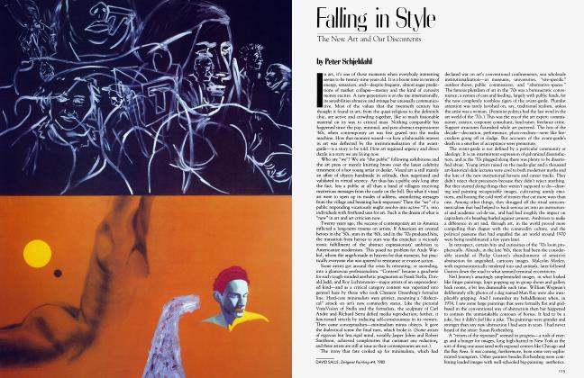
Though Constable never left England during his lifetime, his paintings were exhibited at the Paris Salon, and his careful attention to light and sky (he was an amateur meteorologist), not to mention his virtually unprecedented habit of painting out-of-doors, doubtless had a great influence on the French Barbizon school and later, of course, on the impressionists. In some of the late paintings, like Hadleigh Castle and Hampstead Heath: Branch Hill Pond, the canvas is alive with a kind of brushy passion and astonishing color—fuchsias and golds and violent reds. The fact of the matter is that though Constable remained in many ways a conventional painter of landscapes, in these late pictures—and in the exquisite, almost abstract cloud studies—one can see the introverted intensity, the riot of color and brushwork contained within the formally quiet outlines of the paintings. Certainly this contained explosion is every bit as wild as Turner’s unkempt forms, and the sight of these Constables all together, as clean and bright as the day they were made, should keep an old rivalry alive. -APRIL BERNARD
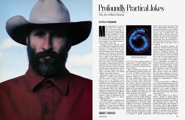
ROBERT RAUSCHENBERG. The preponderant aesthetic failure of Robert UJRauschenberg’s work since the middle 1960s—hectic, spectacular failure, on a scale appropriate to such an outsized talent—is as embarrassing as a sofa too uncomfortable to live with and too big to fit out the door. His early achievements, notably in translating arcane modernist aesthetics into a brash and lyrical American vernacular, are still central to contemporary art. His place in art’s social history, as an artist-hero of the media era, is likewise secure. But something terrible happened to the quality of his inspiration at a certain point, and it keeps right on happening.
Rauschenberg is in a period of stepped-up production. A three-gallery show in SoHo in January featured dozens of new paintings, sculptures, assemblages, collages, photographs, and ceramics, many of them made during the artist’s working tour of China and Japan last year. His familiar, manic combinations and transformations of found imagery were on exhibit, along with a typically impressive array of technical wizardries. But it was all desperately willful and, despite its ostensible variety, deeply repetitive. Having once changed art, Rauschenberg now seems content to chum out Rauschenbergs—a strenuous and singularly joyless enterprise.
PETER SCHJELDAHL
JAN GROOVER (Neuberger Museum in Purchase, New York, April 10-June 112; Daniel Wolf Gallery, New York, April 5-30). In the late 70s Jan Groover exhibited a series of color photographs that set the traditional concept of the still life on its ear. These photographs contained dense and disorderly collections of slightly larger-than-life plants, knives, forks, and water-filled Pyrex bowls. No boundaries or sense of place can be detected in them; the silvery surfaces of the kitchen equipment reflect, the water distorts, and the green foliage conceals. These photographs have an abstract and unsettling beauty; the objects in them seem allied in malice.
In 1980 Groover began to work with the platinum-palladium process, an early process that many photographers are returning to, though rarely with Groover’s sense of experimentation. She produced a series of portraits which succeed in part because she neither revered nor manipulated her subjects; she allowed each sitter’s personality to control the photograph.
In her new work she has explored the great range of tone permitted by platinum palladium in landscapes, urban scenes, still lifes with huge shadows that drop across most of the frame, small and tightly cropped figure studies, and close-ups with objects and animals. The flexibility of the process is apparent: the urban scenes have a cool, almost icy definition of detail; the Moroccan garden scenes are suspended in light and shadow; New York still lifes seem to drift in a warm, dreamy haze. Her attention to toning and her use of different paper stocks reflect her belief that each photographic print is a unique work of art, not just one in a series, and this belief makes her a welcome anomaly in this postmodernist age.
MIMI THOMPSON
Subscribers have complete access to the archive.
Sign In Not a Subscriber?Join Now
